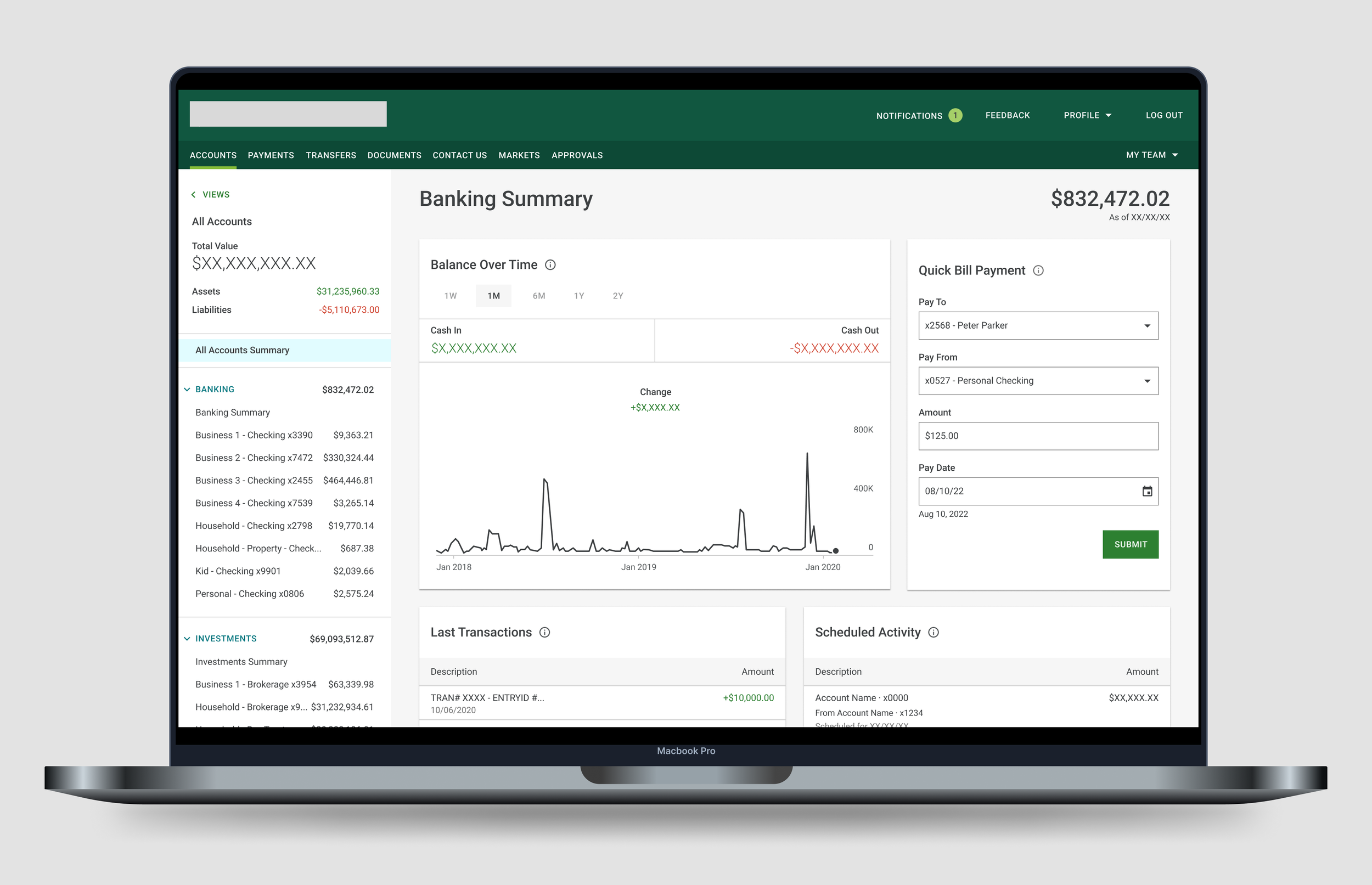
Quick Bill Payment
Fortune 500 Financial Company
This project was completed for a preeminent financial institution. Some information has been removed for confidentiality.
——
01 Project Brief
Timeline
9 Months, 2021-22
Overview
The financial institution this feature was created for caters to high net worth individuals who have a handful to hundreds of payees. The goal of this project was to create a quick and useful way to pay bills from the homepage.
Contributors
- Lead UX/UI Designer, Alyse Brown
- Product Owner
- Development & QA Team
My Contribution
- Design Strategy; How do we approach this problem?
- Research; What can we learn from current industry standards and our users?
- Design Execution; Wireframes, prototypes, high-fidelity designs for development hand-off
02 The Opportunity
02-01 : User Impact
How do we allow users to seamlessly and efficiently pay their bills?
02-02 : User Impact
How do we help users navigate through hundreds of bills and payees?
02-03 : Business Impact
The opportunity to create a quick payment feature would enhance the experience of frustrated users and increase company profitability by growing and retaining online banking clients.
Before Experience
User Frustrations
Client feedback we received that contributed to the launch of this project:
Users were frustrated because a quick bill payment feature existed in an older version of the banking application. When that legacy application was decommissioned, quick bill payment was not brought over to the new experience.
Users found the desktop experience difficult to navigate. Desktop used a third party service iframe while mobile was a custom build using only the third party service’s APIs. Users were upset with the inconsistent experience.
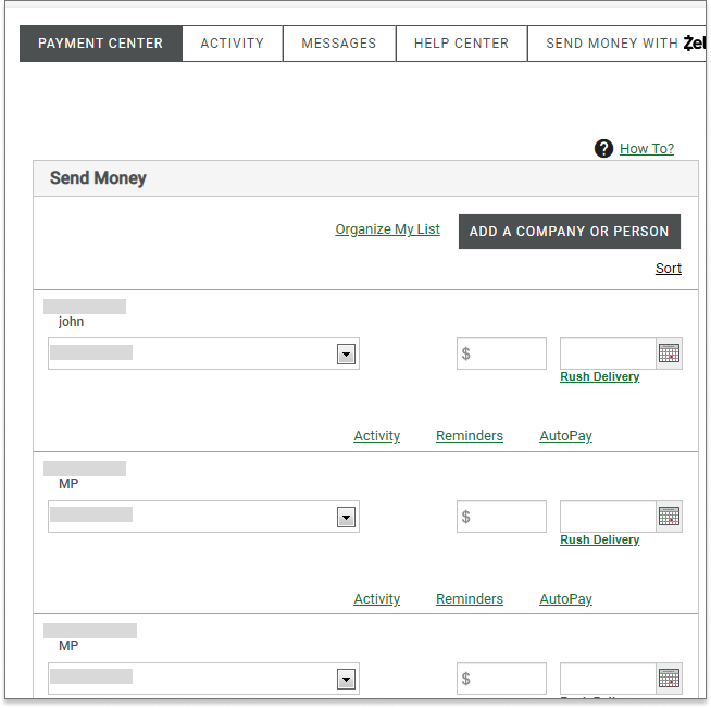
A long list of potentially hundreds of payees with no way to search or filter through the information.
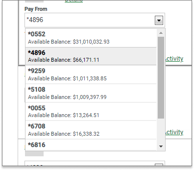
Again, a long list of potentially hundreds of accounts with no easy way to navigate through them.
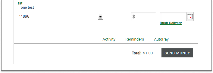
Users have to scroll to the bottom of the page to find the ‘Send Money’ button.
03 Discovery
Competitive Analysis
To kick off this initiative, I conducted a competitive analysis to gather a baseline of the payments experience in the industry. I looked at five competitors, created matrices to analyze the information and prepared a presentation with key takeaways and recommendations to present to the larger product team.
Not only did the competitive analysis help guide this project’s designs, but it was also used to make a case for the complete redesign of the desktop payments experience. The suggestion was to bring the desktop experience in-house and create a custom experience that was consistent with mobile and in line with current industry standards.
Matrices
04 Design Process
After reviewing client feedback and gathering insights from the competitive analysis, I completed several iterations of designs in accordance with step 5 of the process diagram below.
Design Iterations
01 Exploration of a flow using modals
02 Card Designs - playing around with organization and UI
05 Research and Analysis
Round 01
Usability Testing
After reviewing the wireframes with the larger design and product teams, I worked with our in-house researcher to prepare the designs for usability testing. Since this was a prominent feature that would exist on the home page, the decision was made to conduct usability testing. The goal was to learn if participants were able to complete the payment tasks successfully and identify any changes required to improve the experience and overall user satisfaction.
All users (5 of out 5) needed a hint in order to find the Bill Pay card on the Opening Page.
All users expressed that they wanted fewer steps and clicks.
“
“It was just up at my right hand corner (in ECP). So my thoughts are like, why is it at the bottom there? I really liked what it was (in the old version). I use (it to) check my accounts and Bill pay. I'd rather see it more prominent somewhere.”
“
“One thing that I would like that was on, the old system was I didn't actually have to go into a payment.
I just click on that, fill in, paying Northern Illinois gas, the amount the date, and I'm done. It was kind of like a shortcut and I missed that. It just saves me time.”
“
“Pressing Pay Bills here is the same as if I go up and press Payment, you know, if I mean, I could go down to Bill pay, but that doesn't really give me easy access right here to pay a bill. Really quickly.”
Design Iterations
I iterated on the designs based on the findings from round 01 of usability testing. Key changes included:
Navigation - brought the card to the top of the page to increase discoverability.
Reduction of Steps - redesigned the card from a modal flow to a single card with drop downs.
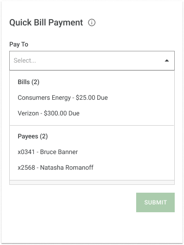
Structure - separated Bills and Payees into two sections in the ‘Pay To’ field.
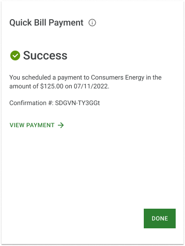
Payment Confirmation - created a success screen highlighting the confirmation number.
Structure
Payment Confirmation
Round 02
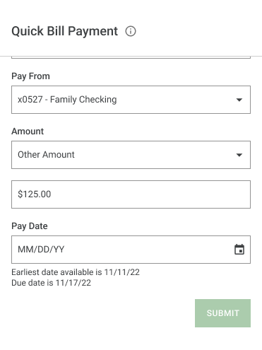
The new card design with the iterations from round 01 of usability testing went through one final round of testing. This time, the findings indicated that users were satisfied or very satisfied with the new quick bill pay feature. The only iterations done after this round of testing focused on the date selection. Users wanted to know that their bills were being paid on time. Therefore, I revised the problem statement and created a more robust date selection design.
Problem Statement
Users need a frictionless and quick way to complete their payments. They want to easily navigate through their dozens of bills and payees. Users also want to know that their bills have been paid on time.
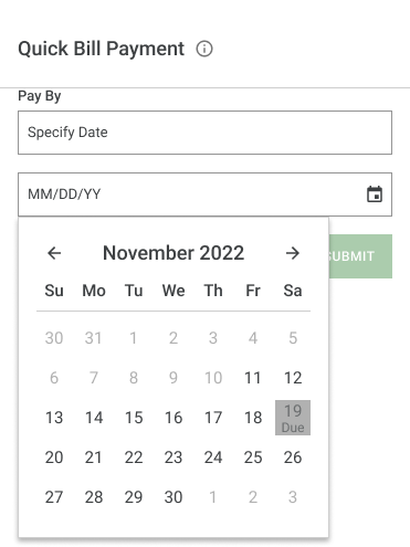
Design Iterations: Date Selection
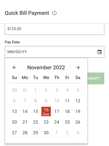
Based on feedback from round 02 of usability testing, I created a more robust date selection experience. Changes included:
A calendar date picker for selecting
Showing the bill’s due date in the calendar
Showing the earliest date available for payment
Disabling any dates not available (e.g. holidays)
-
![]()
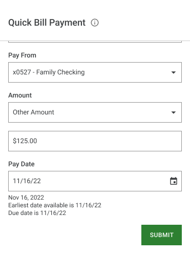
1. Pay Date field is a calendar date picker and displays the earliest date available.
-
![]()
2. Calendar displays the due date.
-
![]()
3. Calendar displays a disabled date.
-
![]()
4. Date has been selected.
06 Results
I created a quick bill payment design that successfully allowed users to make payments quickly and efficiently.
Currently, Quick Bill Pay is the third most used feature on the Accounts page.
07 What's Next?
O1 Apply the quick bill pay updates to mobile.
Improve navigation of bills and payees by adding categories in the Pay To and Pay From fields.
Increase clarity when bills are due by creating a date picker with bill specific information.
O2 Improve the full desktop payments experience.
Based on findings from my initial competitive analysis, my suggestion is to start exploring ways to further improve the larger payments experience on desktop.